VideaHealth Odontogram
Drawing an Odontogram
A learning and information-design exercise
When I first started working on the VideaHealth product, there was no easy way to visually represent the AI findings from the analysis. Clinicians would view an overview of all the x-rays or a written summary of the findings. While that worked fine for many, I wanted to explore creating a diagram-like representation that I thought could be more intuitive and communicate the findings at a glance.
Such a thing had already existed of course, for decades: the “odontogram.” It has a rich history as a tool for clinicians and is already well-understood and used daily in patient charts.
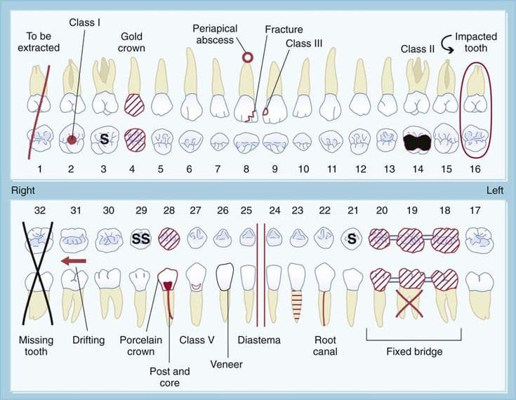
I liked a lot of the existing designs, but wanted to make a version that would work well with the findings from Videa's AI, leveraging some of the familiar visual conventions (and simplifying them where possible). I had hoped to start with some existing anatomical drawings of teeth, but all the sources I looked at had some drawback or another (or were not in a digital format).
So I decided to draw my own teeth (in heavy consultation with the excellent and generous clinicians at Videa, who gave me lots of advice and caught many dumb mistakes!).
The first versions I drew were mostly line-drawings with counts of findings and a color-coded system for overall severity of disease. The feedback on that was that an easy way to decide on colors was not so simple, and it was better to focus on conveying the details of the findings specifically.
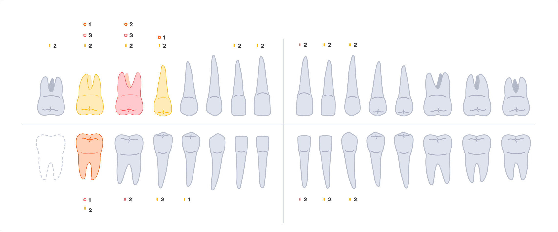
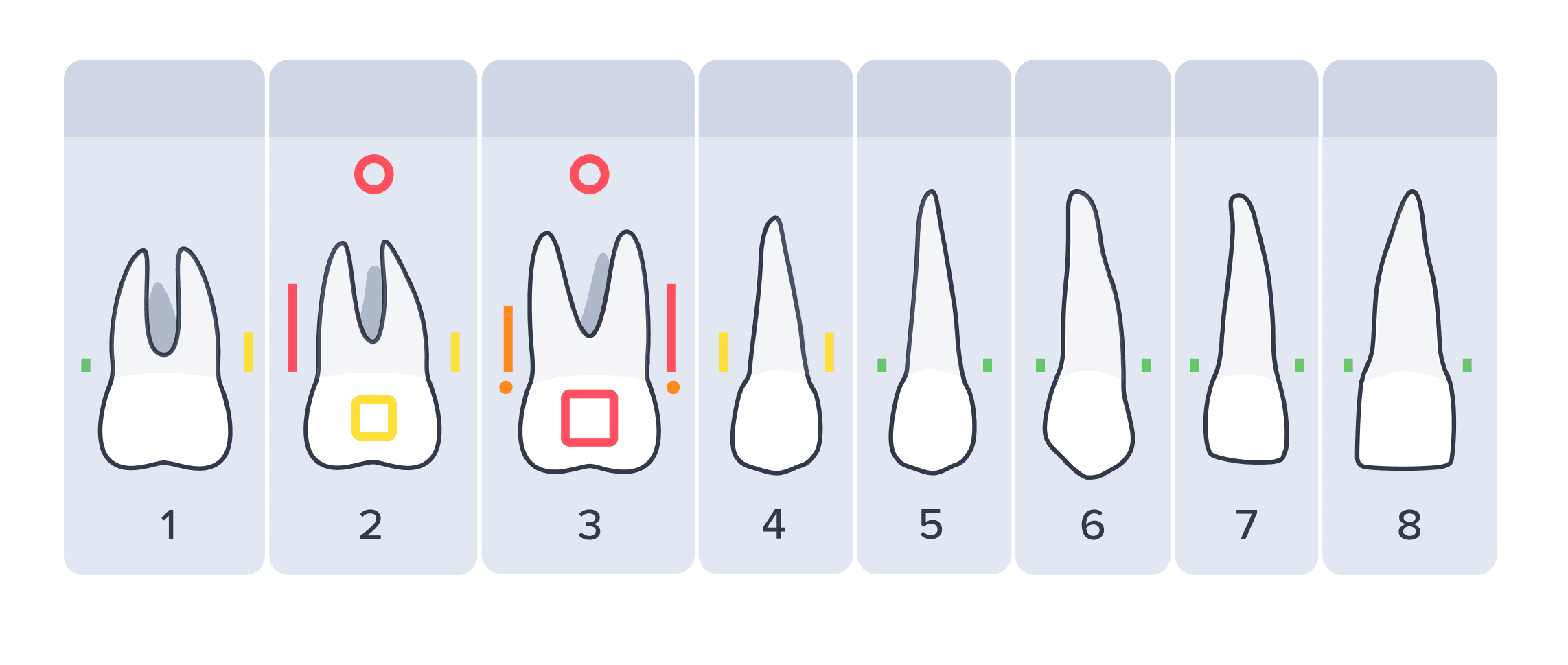
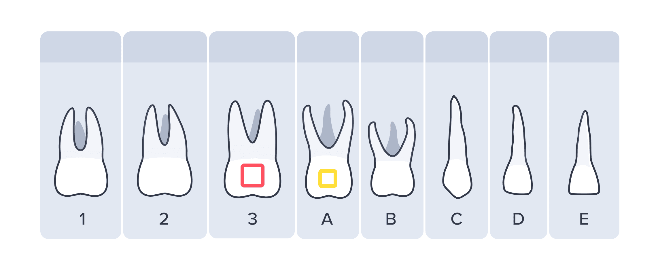
The line-drawing didn't work as well with visual elements overlapping each other, so I made a simple outline version (with some anatomical adjustments) instead.
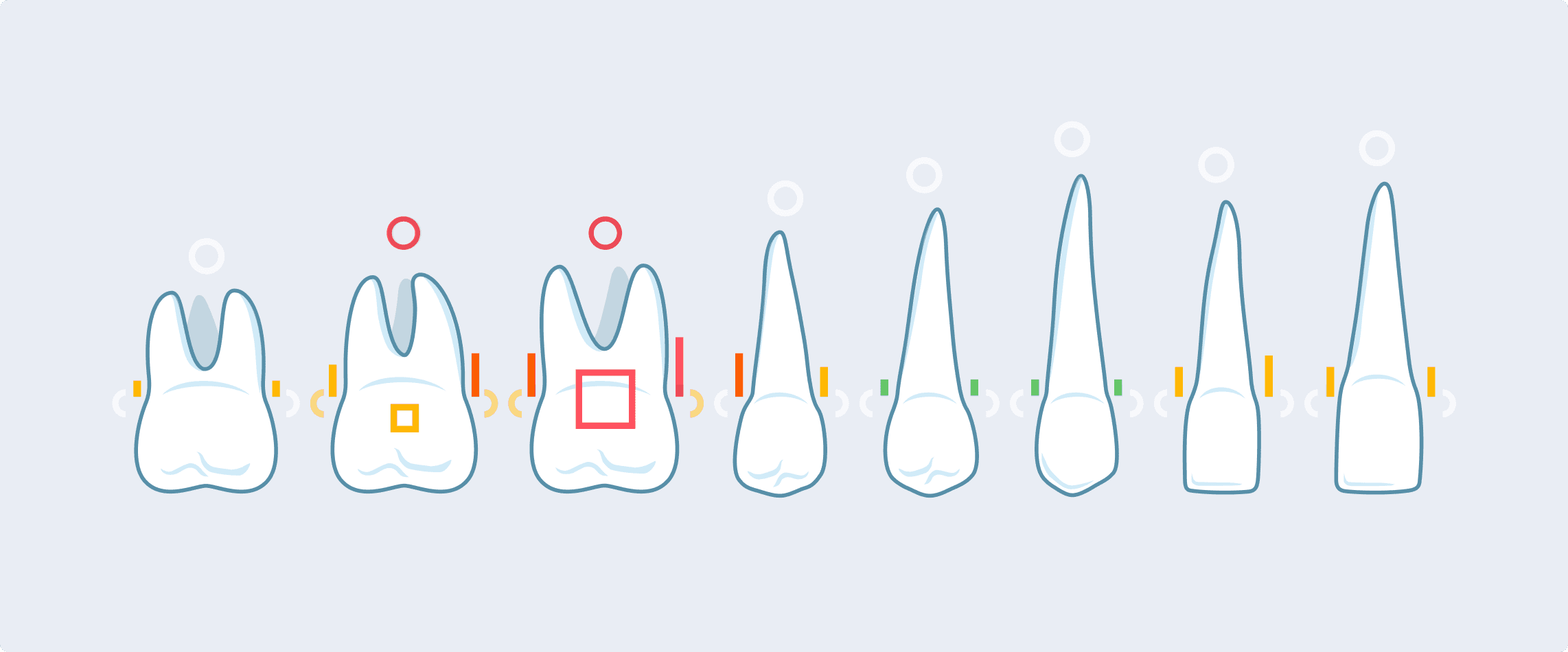
This version could support lots of indicators for various findings.
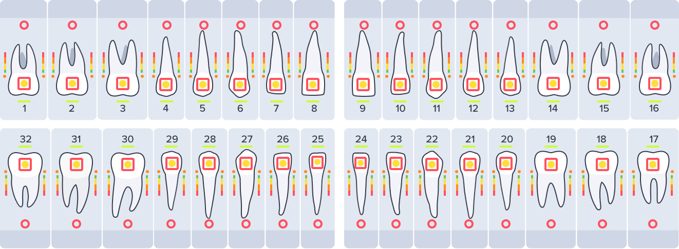
Eventually I added drawings for primary (kid) teeth as well (which often coexisted with permanent, or adult, teeth in the odontogram).
Within the product, the odontogram could now offer an alternative to the x-rays to quickly see all the findings. The drawings were exported from Adobe Illustrator for use in Figma and the codebase as SVG vectors and React components.
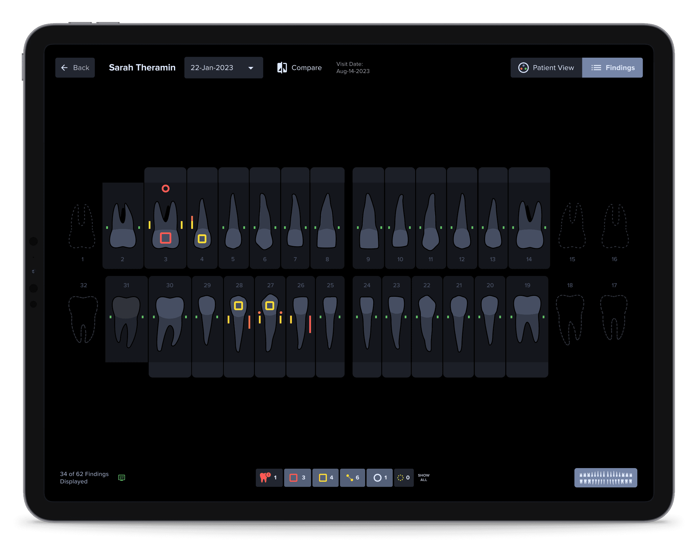
Immediately afterwards, with a larger roll-out of the product to many new practices, we discussed having an “onboarding” experience integrated into the product. With many clinicians starting to use the product without direct contact with Videa, it was important that they get some basic knowledge about what to expect.
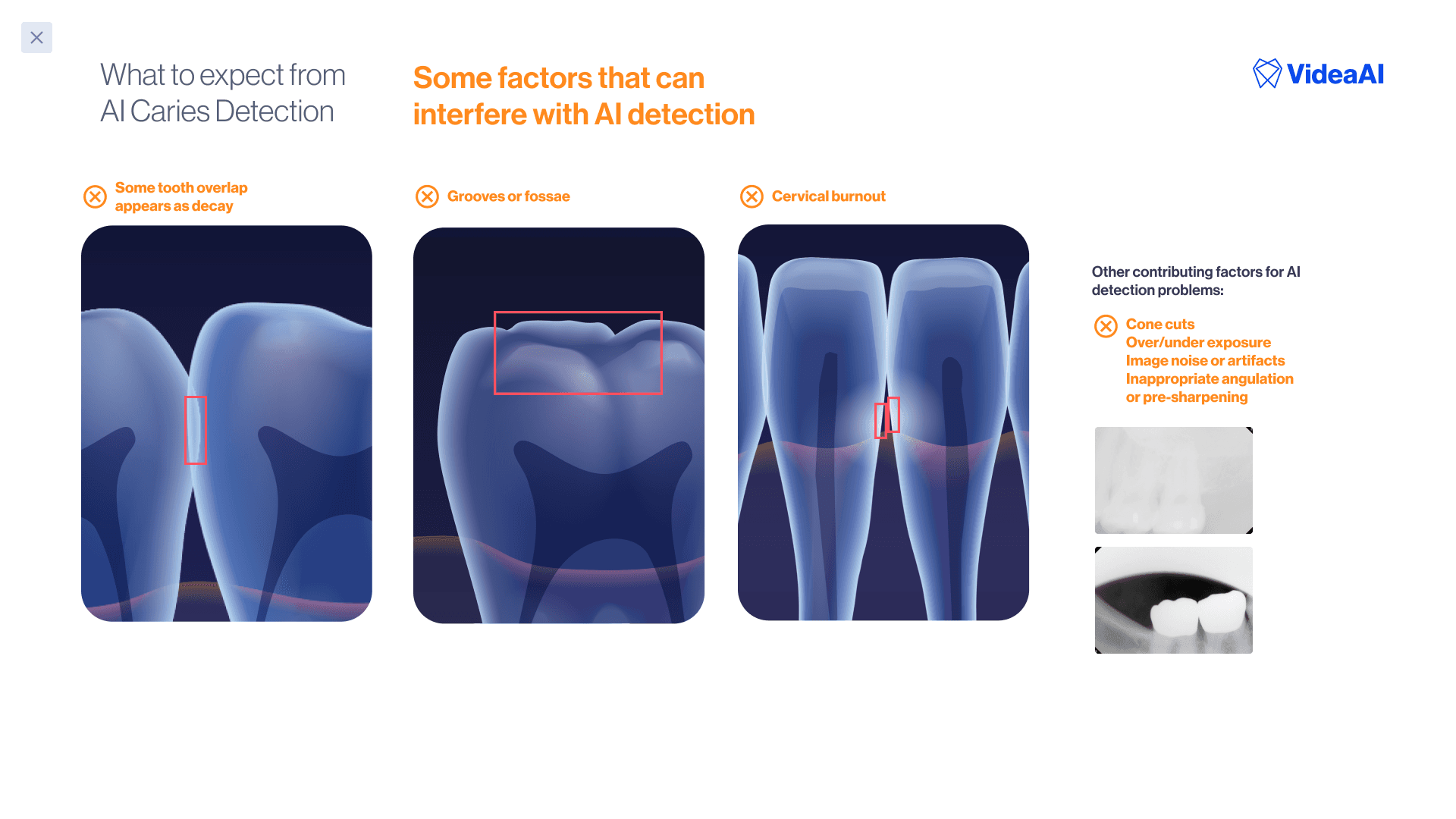
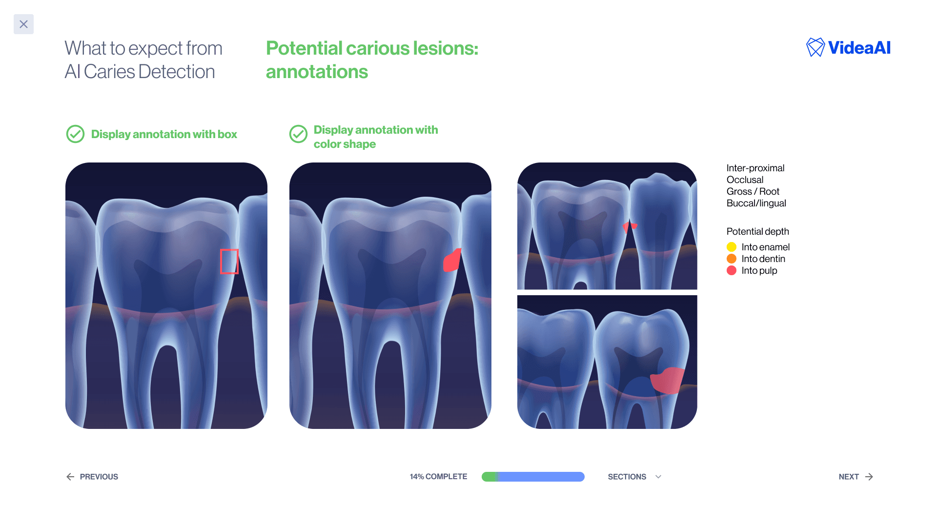
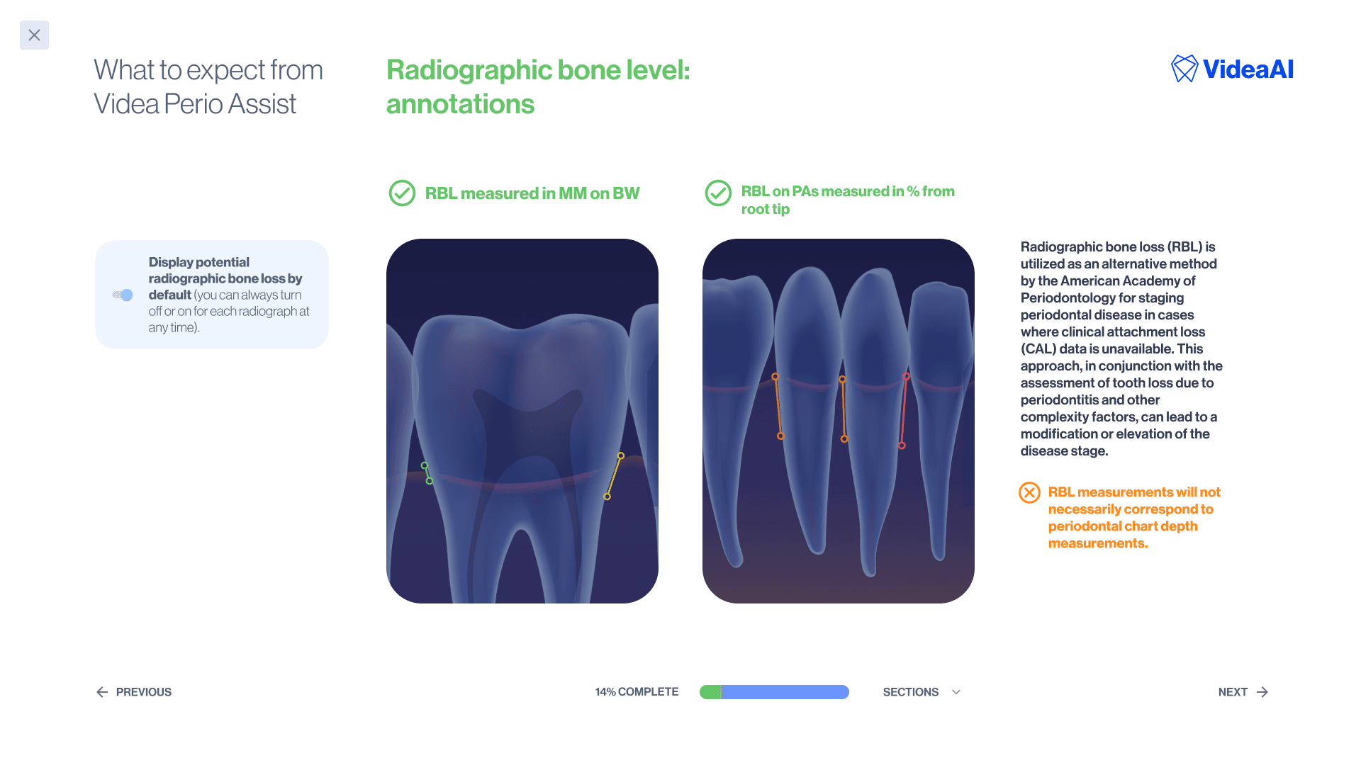
At first, I thought that I could simply use the same drawings as the odontogram, or use actual x-rays to show the way AI findings worked. Neither of those options worked well unfortunately; the odontogram was too simple, and the x-ray examples were all so specific that they distracted from the points we were trying to illustrate.
So, I decided to draw some “3-D teeth” that were simplified but recognizable as the kind of anatomy clinicians would see in an x-ray (but with the findings so clearly presented they would be impossible to miss).
This was my base illustration (drawn in Adobe Illustrator with blends and gradients, no 3-D software or models used) from a set of my own dental x-rays.
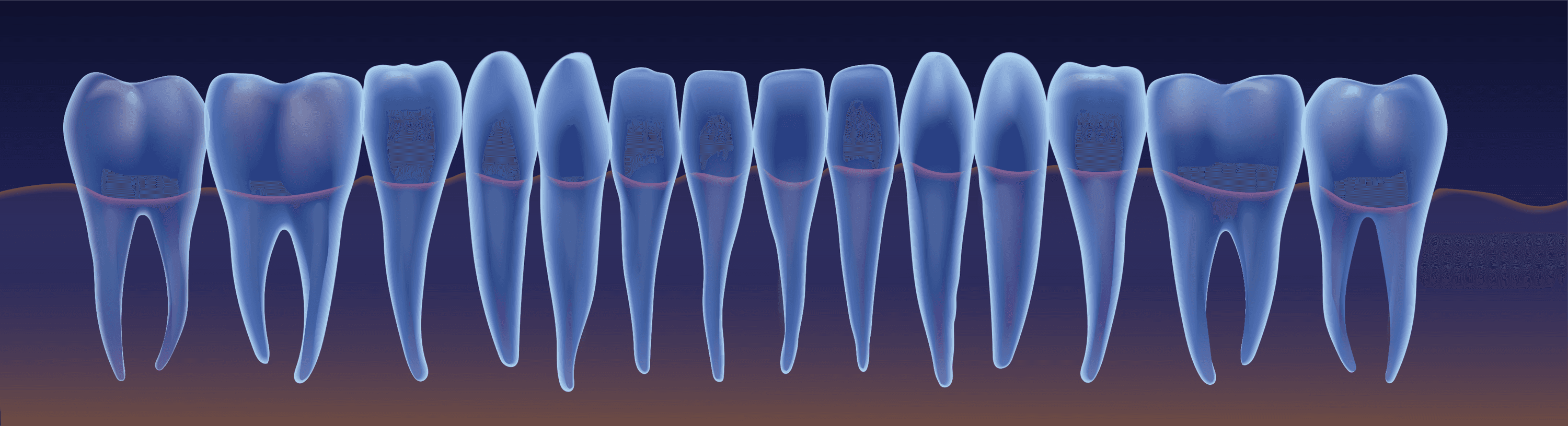
The onboarding slides then had annotations added on top dynamically, with SVG vectors.

This project did not have a hard metric or performance objective attached to it, but I heard a lot of anecdotal positive feedback and believe it helps improve the overall perception of the product as possessing good fit-and-finish.